Varco Pruden
Upon joining BlueScope Buildings North America, I found myself in a key stage of Varco Pruden's brand transformation journey. While the process had already begun, significant progress was yet to be made, with the brand refresh only 30% complete. In response to this opportunity, I assumed a leadership role, driving forward the revitalization efforts. Spearheading the project, I led the team in refreshing the design systems and implementing the new brand identity. Explore highlights of this brand design rollout below.
Year in Review
In 2020, I was tasked by the marketing team to lead the editing of a video encapsulating all the updates initiated during the brand refresh. From literature revamps to social media templates, email newsletter enhancements, and the creation of a new website, each project showcased in the video reflects my creative leadership and direction. This video serves as a testament to the innovative approach I brought to driving our brand transformation.
|
|
Design Guidelines
|
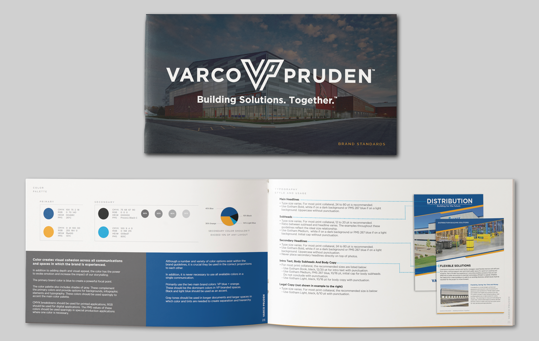
I created a style guide book for Varco Pruden, utilizing Adobe InDesign to tailor every aspect to their unique brand identity. This comprehensive guide defined typography styles, logo specifications, and color palettes, ensuring consistency and clarity across all materials. Drawing from color theory principles, I selected hues that encapsulate Varco Pruden's essence. The primary colors, Deep Blue and Orange Blaze, evoke reliability, innovation, and creativity, mirroring the brand's commitment to flexible steel solutions. Complemented by Sky Blue as a secondary color, the palette symbolizes trust and professionalism, reflecting Varco Pruden's collaborative approach with builder partners. Each element, from font choices to logo variations, was designed to provide a cohesive framework for impactful branding and design execution across various mediums, tailored specifically for Varco Pruden's vision and mission. View the entire design guideline book here.
|
|
Literature Overhaul
|
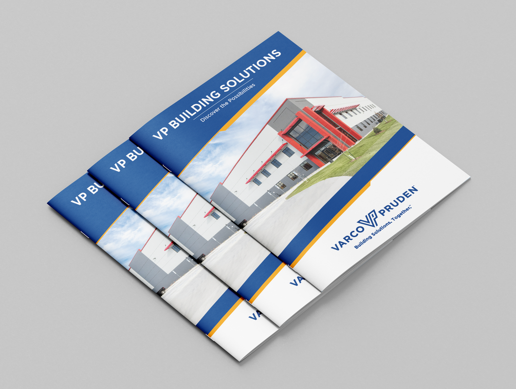
Recognizing the need for a substantial overhaul of Varco Pruden's literature at BlueScope Buildings North America, I spearheaded a project to update over 60 pieces. This involved creating InDesign templates and coordinating with external freelancers to refresh content, ensure design consistency, and align messaging with the new brand identity. Through careful planning and execution, we successfully transformed Varco Pruden's literature suite, enhancing its relevance and effectiveness in communicating the brand's value proposition. The VP Building Solutions brochure is an example of the refresh.
|
|
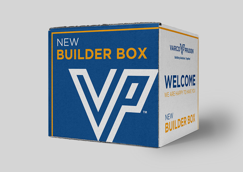
New Builder Box
|
When approached by the VP Marketing team to revamp their welcome kit for new builders, I saw a chance to innovate. Traditionally, a plain box was used, but I took the initiative to design a custom solution. This new box not only housed essential literature but also included a personalized letter from the president and thoughtful welcome gifts. By infusing creativity into this project, we aimed to leave a lasting impression on our new builders, setting a welcoming tone for their journey with us.
|
|
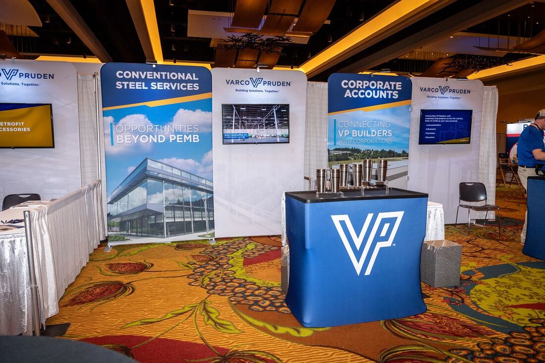
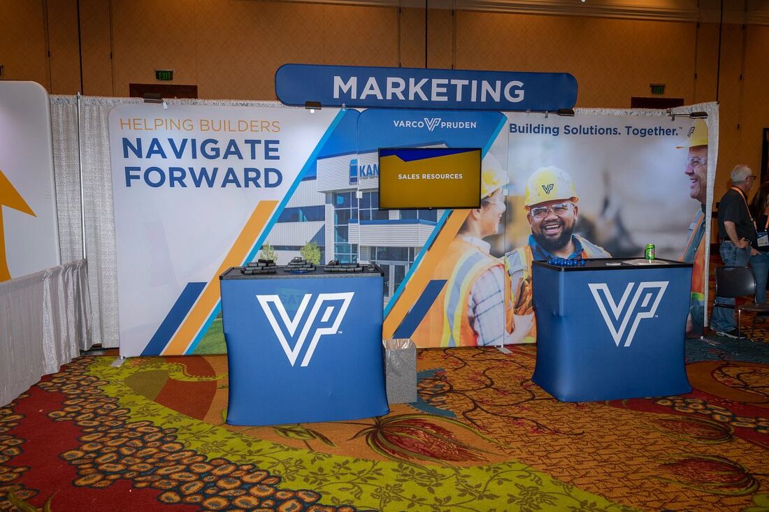
VP Event Presence
|
To ensure that builders attending the bi-annual VP Builder Conference were immersed in the new branding, I spearheaded the creation of a suite of booths that authentically represented our refreshed brand identity.
|
|
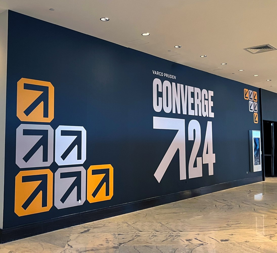
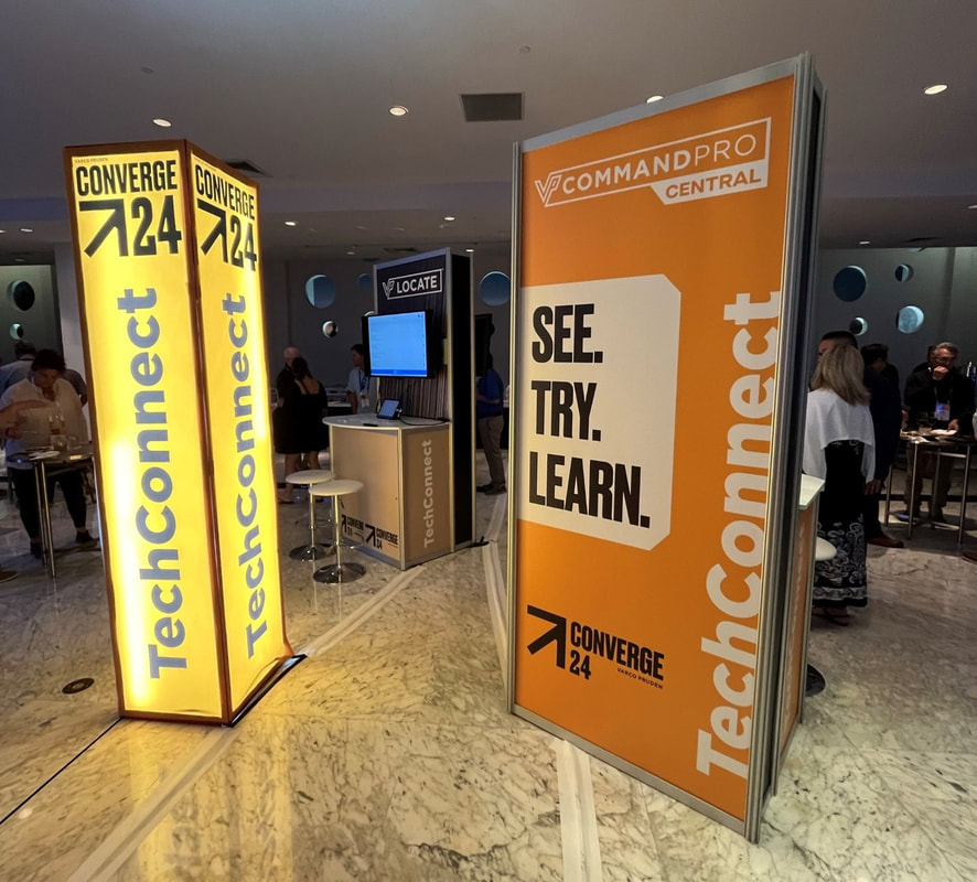
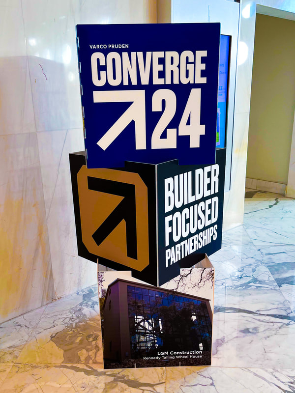
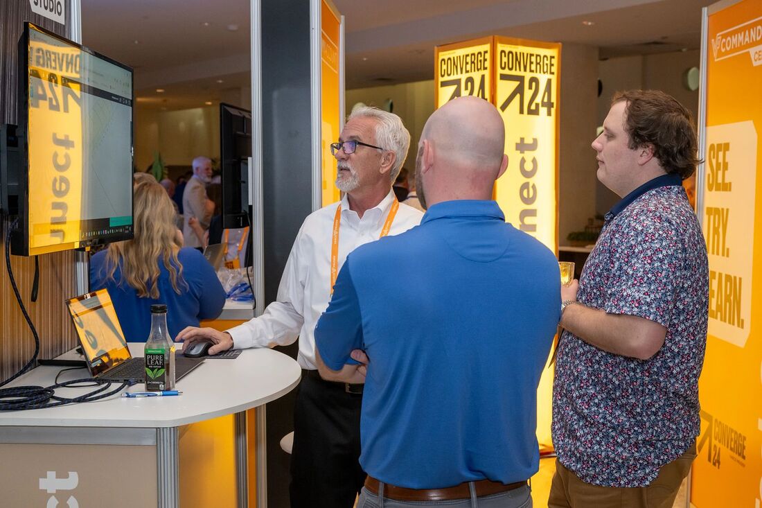
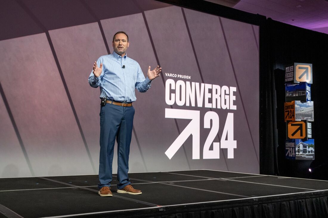
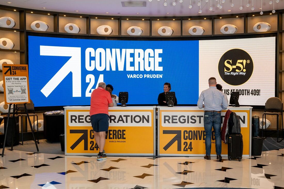
VP Converge - Forging a Fresh Direction
|
Varco Pruden hosts a builder meeting every other year, and leading up to the 2024 gathering; our team embarked on a mission to cultivate an environment where builders could seamlessly immerse themselves in products, ideas, and connections, free from the constraints of a singular theme, which had been done in years past. In response, I proposed a fresh direction: transforming our builder meeting into a user conference. After numerous brainstorming sessions, we settled on VP Converge as the conference's new identity. Collaborating with an external agency, I spearheaded the creative direction and production of various experiential design elements throughout the conference.
|
|